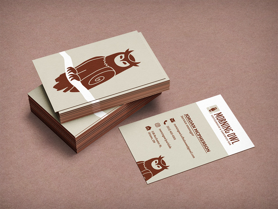
Morning Owl Brand Redesign
Project Overview
The goal of this project was to refresh the brand identity of this beloved Ottawa coffee shop! Some deliverables included crafting a bold, memorable logo, a sleek and accessible website, and a dynamic logo reveal animation. With a focus on enhancing brand recognition and appealing to their target audience of local students, professionals, and coffee lovers, the redesign aimed to modernize and boost their online presence, increase customer engagement, and create a lasting impression.

The Concepts
The journey from initial sketches to the polished final logo was iterative, with numerous concepts and explorations. We focused on refining the owl mascot, creating a design that’s detailed and charming without overwhelming the logo’s simplicity. After several rounds of revisions, we landed on a striking, memorable logo that feels both polished and personable, which stemmed from concept 2.

Colour Variations
Similarly to the sketches, the process for choosing colours was also very iterative. The process included creating full-colour, black-and-white, and reversed versions to suit various uses. In addition to the logo, wireframes and high-fidelity sketches helped shape the new website, ensuring a sleek and user-friendly design. To top it off, a smooth logo reveal animation was made to enhance the brand’s overall visual impact.


From Concept to Completion
I’m very proud of the final redesign, since each element worked seamlessly to create a cohesive and visually strong identity. It captured the vision I had from the start, and the chosen concept brought a fresh yet timeless feel to the brand. Overall, this project was a valuable lesson in the importance of sketching extensively. By pushing past the first few ideas and experimenting with countless variations, I discovered new creative directions that wouldn’t have emerged otherwise. It reminded me that true innovation often comes from exploring beyond the obvious solutions!


